
I wasn’t surprised to read in the journal, The Register, about the outages and performance problems at Zoom and Microsoft Teams as the business world switched, almost overnight, to remote working in the face of the challenges of slowing down the progress of the Covid-19 pandemic.
The article, and the charts included in it, seemed to suggest that WebEx from Cisco and Google Hangouts handled the situation much better. But, as the Register pointed out, their charts were based solely on outage reports from Down Detector. So it would be fruitless and unfair to make any comparisons and take any conclusions at this stage.
However, this exceptional set of circumstances calls into question the agility and resiliency of the IT systems we have increasingly come to rely upon. While the “man on the Clapham omnibus” might think that the Cloud has made computing infinitely scalable and very simple, anybody in IT operations knows that managing IT infrastructure has become very complex and solutions to the complexity are legion. Have a look at my reports and blogs on the subject and you will get the picture.
But there is something very simple you can do to start to identify the risks inherent in your systems as circumstances change rapidly and volumes explode. There are really only two fundamental questions. How agile are my systems? In other words, how quickly can I change them to meet changing business demands? And, how resilient are they? In other words can they handle rapidly increased volumes without degrading, falling over or compromising security?
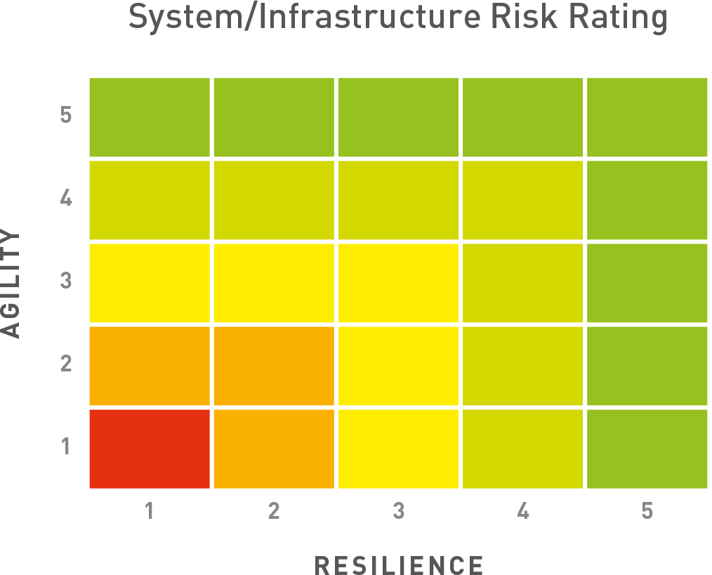
Take a simple 5×5 chart like the one shown here. The vertical axis represents Agility and the horizontal axis represents Resilience. Use it to gauge total systems agility and resilience or individual applications and the infrastructure they utilise. Give individual charts to people involved in developing, deploying and maintaining the systems in question and get them to mark which box on the grid they would place the system in…1 being not resilient and agile at all, 5 being extremely agile and resilient. Don’t allow them to collaborate. Get them to give their score without spending more than a minute or two to decide. You want their individual views. Stress that there is no right or wrong answer.
You can then derive scores from the boxes that are marked. For example you might get one system that is marked in Box 5 for both agility and resilience. This would give a perfect score of 25. Another might be marked as 2 for agility and 5 for resilience, giving a score of 10….and so on.
You can colour code the chart. A score of 25 is obviously green and a score of 2 is obviously red. Beyond that you need to set your own traffic light colours to reflect the risks to the business of systems that are not agile and/or resilient. I know this is very simplistic but bear with me. One of the biggest benefits of getting a number of individuals to give their ratings separately is the potential to identify divergences of view, understand and debate the reason for such divergence and move towards a consensus position. I have found on a number of occasions that the “newbie” or the “maverick” often have valuable insights that experienced long-term staffers have overlooked or dismissed prematurely.
Given the complexity of today’s hybrid IT infrastructures, the continued preponderance of siloed teams and multiple tools, getting a simple, visual indicator of potential risks might prevent a world of pain later on. In a few years’ time everyone might have end to end visibility across their entire IT estate, with brilliant predictive analytics and automated problem remediation. But we are not there yet. As we all hit the virtual meetings trail, let’s hope that those systems haven’t been marked with a score of 2!
